I've joined the Color Collective put on by
Sewtopia I would highly recommend getting in on the next session of this program as the first two months have been fabulous. Month 2 fabric arrived and I pulled out my bins of solids. This time I had 3 colors that were close to matching. This adds up to 19 new colors that I've got to work with in the first two months. Talk about stretching outside my comfort zone.
Month 2 was all about Foundation Paper Piecing. I've done this before, but have never made a whole top with this method. It took me a bit to find my tools; postcard from my Mom and Dad on their Alaskan road trip, and my Add a Quarter ruler. A must have ruler for this type of work. And sew it begins. Cutting and trimming and pressing and trimming and sewing and trimming and pressing.
First three blocks using 9 of the 12 colors. This project consisted of 25 blocks so I was trying to do math that would have me use each color in each of the 3 sections of the pattern. I got dizzy after the first batch of blocks.
I kept at it. I spent about 5 hours in the studio yesterday. It was interesting how my mind moved to certain things with color combinations. One set had me think of marching band uniforms, others reminded me of school colors, NFL colors, etc That was a tough hurdle for me. I love the combo of green, navy and grey, but that screams Seahawks!
Here I've got enough combos done to start assessing the last few blocks for color and value. I do love a good gold (cheddar) and had to restrain myself from using it too much. At this point, 20% of the blocks had gold. And lets talk about the fuchsia. I had even more blocks with that color. What you can't see (due to my less than stellar photos) is that there is a bright watermelon color and another color that looks like a creamsicle. They seemed sharp, vivid, almost neon to me. I finally pulled out one offensive block and set it aside.
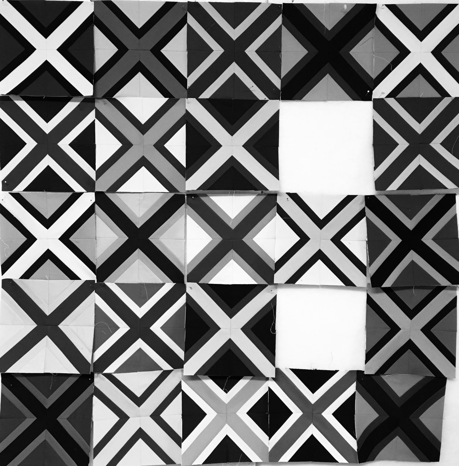
I went to my trusty black and white setting to see only value. This makes you look at things in a very different way.
I made a few more blocks and only had 2 holes left to fill. At this point, I put back the awful block as I added a touch more of that particular color and things started to balance out. This was pretty dark along the right side but things were coming together for me.
My last two blocks started with the outside triangle colors. I wanted to make sure they were not the same as bordering blocks and I went with the dusty blue and fuchsia.
This next photo shows how I worked with dark and light strips. The bottom part shows that when I put the burgundy fabric on the coral, I left a few threads of the coral showing. When I flipped and pressed, (the top part of the photo), there is no shadowing of the dark color.
The finished block. Oh how I loved this dark burgundy with the dusty blue.
In the last block, here came one more of these (hard for me to work with) colors. That light mint green........ack! But it really works in the whole project.
Here was my "not so final" layout. I started back with the black and white photos, did some rearranging and committed to a layout. This project is one of those where you can move and move and move and never come up with the "perfect" layout.
I called it done, and sewed the blocks into a top. Yes, on the left side I have two green X's on top of each other. Geez! But I am very pleased with the lessons I learned while making this one. For some reason my blocks did not all nest together, which has my brain a bit puzzled. I will be back in the studio doing some testing on why that happened.
I was concerned that my top would look fuchsia and gold so I kept backing off those colors. They were two of the colors I had in my own stash and I used as second lighter value of gold in some blocks. I also cut into my piece of fuchsia fabric, so in theory, both the gold and fuchsia should probably not even be in this photo. These are my left overs from 1/2 yard cuts of all the colors. You can barely see the dark burgundy, I sure loved using that color. The color that was used the most was the dark green, and with 3 other greens in this range, I struggled to not have a green quilt top.
These were my colors that I pulled in. A very dark navy, a dark forest/teal green, two shades of gold and a dark raspberry shade. I also added in a grey as that gave me an extra light without pulling in more of the corals and mint greens. I did love the baby pink, but again, used it sparingly.
Last shot the finished top. I love it. Combinations were used that really stretched my comfort level but now I have a few more combos that I'd like to try out on a bigger scale. The bottom row holds my favorites. Left corner is burgundy, dusty blue and fuchsia, and the middle bottom is gold, pink and dusty blue. That was my biggest Ah Ha moment. Gold, pink, blue. I LOVE this combo.
So thank you
Tara Faugnan and Amy at Sewtopia, for a fantastic month 2. If you are on IG, you can see posts with the hashtag thecolorcollective Check it out to see how others interpreted these color combinations.
I'll leave you with a fantastic sunset that we had on Friday evening. Birch Bay at it's finest!
Keep stitching,
Sharon


3 comments:
You met the challenge heartily! I checked out the instagram tag- what a feast for the eyes!!
First of all--stunning sunset!
Now, the quilt. I just love the bold, vivid feast for the eyes! Laughed at the things your color combos brought to your mind. Joined you in the never-ending cycle of switching blocks around to "get it right."
The black and white photos are so helpful with value placement.
Your close-up block photos show beautiful precision. Nice work, Sharon!
Wow! Very cool. Great exercise.
Post a Comment